pacman::p_load(scales,viridis,lubridate,ggthemes,gridExtra,readxl,knitr,data.table,tidyverse)Hands-on Exercise 7a
17.2 Getting Started
17.3 Import library
library(CGPfunctions,ggHoriPlot)17.4 Plotting Calendar Heatmap
17.4.2 Importing the data
attacks <- read.csv('Data/eventlog.csv')17.4.3 Examining the data structure
kable(head(attacks))| timestamp | source_country | tz |
|---|---|---|
| 2015-03-12T15:59:16.718901Z | CN | Asia/Shanghai |
| 2015-03-12T16:00:48.841746Z | FR | Europe/Paris |
| 2015-03-12T16:02:26.731256Z | CN | Asia/Shanghai |
| 2015-03-12T16:02:38.469907Z | US | America/Chicago |
| 2015-03-12T16:03:22.201903Z | CN | Asia/Shanghai |
| 2015-03-12T16:03:45.984616Z | CN | Asia/Shanghai |
17.4.4 Data Preparation
Step 1: Deriving weekday and hour of day fields
make_hr_wkday <- function(ts,sc,tz){
  real_times <- ymd_hms(ts,
                        #uses first timezone in TZ
                        tz = tz[1],
                        quiet = TRUE)

  dt <- data.table(source_country=sc,
                   wkday = weekdays(real_times),
                   hour = hour(real_times))
  return(dt)
}
Step 2: Deriving the attacks tibble data frame
wkday_levels <- c('Saturday','Friday','Thursday',
                  'Wednesday','Tuesday','Monday','Sunday')

attacks <- attacks %>%
  group_by(tz) %>%
  do(make_hr_wkday(.$timestamp,
                   .$source_country,
                   .$tz)) %>%
  ungroup() %>%
  mutate(wkday = factor(
    wkday, levels = wkday_levels),
    hour = factor(
hour, levels = 0:23))kable(head(attacks))| tz | source_country | wkday | hour |
|---|---|---|---|
| Africa/Cairo | BG | Saturday | 22 |
| Africa/Cairo | TW | Sunday | 8 |
| Africa/Cairo | TW | Sunday | 10 |
| Africa/Cairo | CN | Sunday | 13 |
| Africa/Cairo | US | Sunday | 17 |
| Africa/Cairo | CA | Monday | 13 |
17.4.5 Building the Calendar Heatmaps
grouped <- attacks %>%
  count(wkday, hour) %>%
  ungroup() %>%
  na.omit()

ggplot(grouped,
       aes(hour,
           wkday,
           fill = n)) +
  geom_tile(color = 'white',
             linewidth = 0.1) +
  theme_tufte() +
  coord_equal() +
  scale_fill_gradient(name = '# of attacks',
                      low = 'sky blue',
                      high = 'dark blue') +

  labs(x = NULL,
       y = NULL,
       title = 'Attacks by Weekday and time of day') +

  theme(axis.ticks = element_blank(),
        plot.title = element_text(hjust = 0.5),
        legend.title = element_text(size = 8),
        legend.text = element_text(size = 6))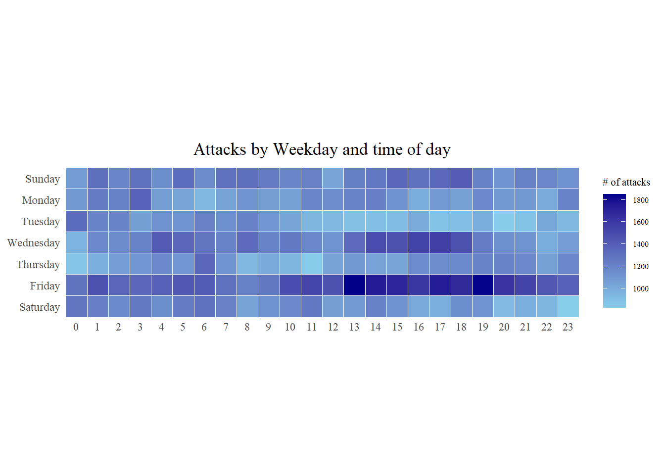
17.4.6 Building Multiple Calendar Heatmaps
Challenge: Building multiple heatmaps for the top four countries with the highest number of attacks.
17.4.7 Plotting Multiple Calendar Heatmaps
Step 1: Deriving attack by country object
In order to identify the top 4 countries with the highest number of attacks, The following was done:
count the number of attacks by country,
calculate the percent of attackes by country, and
save the results in a tibble data frame.
attacks_by_country <-
  count(
  attacks, source_country) %>%
  mutate(percent = percent(n/sum(n))) %>%
  arrange(desc(n))
Step 2: Preparing the tidy data frame
Extract the attack records of the top 4 countries from attacks data frame and save the data in a new tibble data frame (i.e. top4_attacks).
top4 <- attacks_by_country$source_country[1:4]
top4_attacks <- attacks %>%
  filter(source_country %in% top4) %>%
  count(source_country,wkday, hour) %>%
  ungroup() %>%
  mutate(source_country = factor(
    source_country, levels = top4)) %>%
  na.omit()
17.4.8 Plotting Multiple Calendar Heatmaps
Step 3: Plotting the Multiple Calender Heatmap by using ggplot2 package.
ggplot(top4_attacks,
       aes(hour,
           wkday,
           fill = n)) +
  geom_tile(color = "white",
          linewidth = 0.1) +
  theme_tufte() +
  coord_equal() +
  scale_fill_gradient(name = "# of attacks",
                    low = "sky blue",
                    high = "dark blue") +
  facet_wrap(~source_country, ncol = 2) +
  labs(x = NULL, y = NULL,
     title = "Attacks on top 4 countries by weekday and time of day") +
  theme(axis.ticks = element_blank(),
        axis.text.x = element_text(size = 7),
        plot.title = element_text(hjust = 0.5),
        legend.title = element_text(size = 8),
        legend.text = element_text(size = 6) )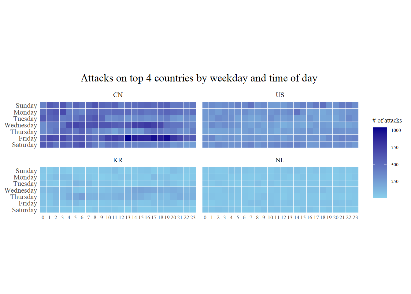
17.5 Plotting Cycle Plot
17.5.1 Step 1: Data Import
air <- read_excel('Data/arrivals_by_air.xlsx')17.5.2 Step 2: Deriving month and year fields
air$month <- factor(month(air$`Month-Year`),
                    levels=1:12,
                    labels=month.abb,
                    ordered=TRUE)
air$year <- year(ymd(air$`Month-Year`))
17.5.3 Step 4: Extracting the target country
Vietnam <- air %>%
  select(`Vietnam`,
         month,
         year) %>%
  filter(year >= 2010)
17.5.4 Step 5: Computing year average arrivals by month
group_by() and summarise() of dplyr compute year average arrivals by month.
hline.data <- Vietnam %>%
  group_by(month) %>%
  summarise(avgvalue = mean(Vietnam))
17.5.5 Srep 6: Plotting the cycle plot
str(Vietnam)tibble [120 × 3] (S3: tbl_df/tbl/data.frame)
$ Vietnam: num [1:120] 15781 16335 18061 22154 21461 ...
$ month : Ord.factor w/ 12 levels "Jan"<"Feb"<"Mar"<..: 1 2 3 4 5 6 7 8 9 10 ...
$ year : int [1:120] 2010 2010 2010 2010 2010 2010 2010 2010 2010 2010 ...str(hline.data)tibble [12 × 2] (S3: tbl_df/tbl/data.frame)
$ month : Ord.factor w/ 12 levels "Jan"<"Feb"<"Mar"<..: 1 2 3 4 5 6 7 8 9 10 ...
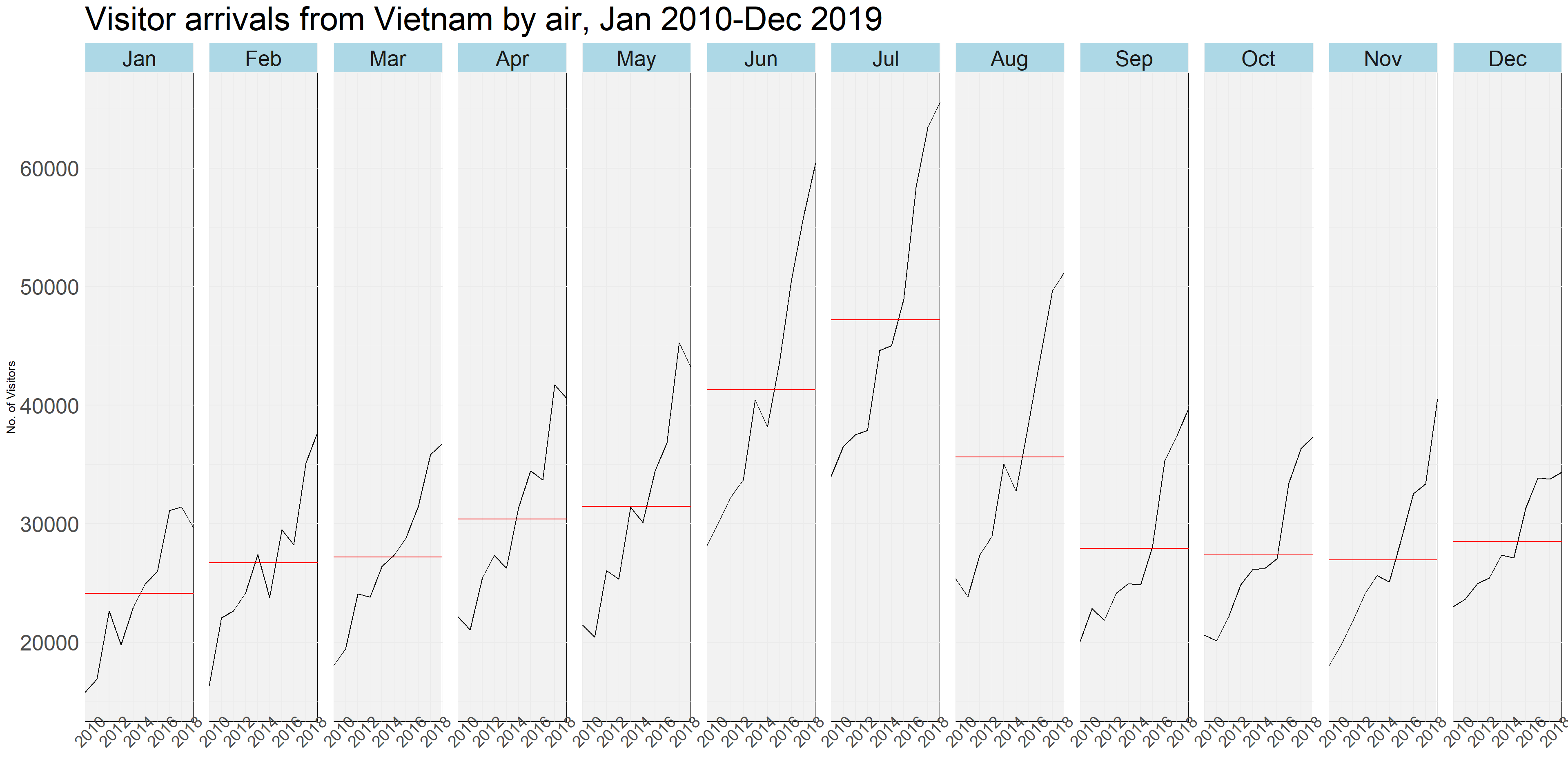
$ avgvalue: num [1:12] 24113 26693 27200 30391 31453 ...ggplot(data=Vietnam,
aes(x=year,
y=`Vietnam`)) +
geom_line(colour="black") +
geom_hline(aes(yintercept=avgvalue),
data=hline.data,
linewidth=0.5,
colour="red") +
facet_grid(~month) +
scale_x_continuous(breaks = seq(2010, 2019, 2),expand = c(0,0)) +
labs(axis.text.x = element_blank(),
title = "Visitor arrivals from Vietnam by air, Jan 2010-Dec 2019") +
xlab("") +
ylab("No. of Visitors") +
theme(
axis.title.x = element_text(size = 20),
axis.title.y = element_text(size = 20)
) +
theme_tufte() +
theme_minimal()+
theme(
axis.text.x = element_text(size = 15, angle=45),
axis.text.y = element_text(size = 20),
strip.text = element_text(size = 20),
plot.title = element_text(size = 30),
panel.spacing = unit(1, "lines"),
panel.background = element_rect(fill = "grey95"),
strip.background = element_rect(
fill = "lightblue",
colour = "grey95"
)
)
17.6 Plotting Slopegraph
rice <- read_csv("Data/rice.csv")17.6.2 Step 2: Plotting the slopegraph
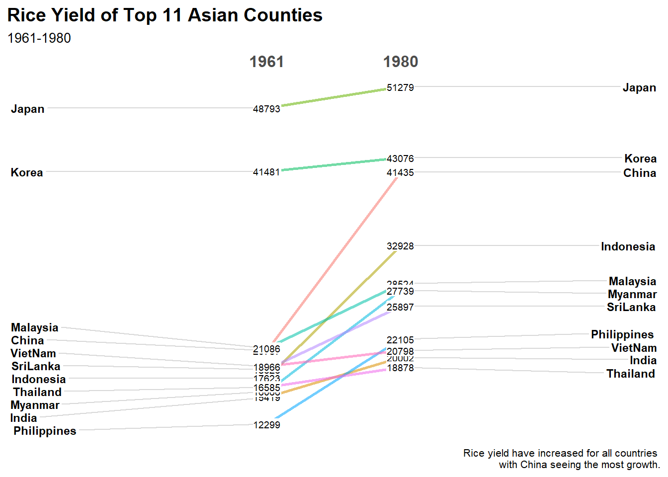
rice %>%
  mutate(Year = factor(Year)) %>%
  filter(Year %in% c(1961, 1980)) %>%
  newggslopegraph(Year, Yield, Country,
                Title = "Rice Yield of Top 11 Asian Counties",
                SubTitle = "1961-1980",
                Caption = "Rice yield have increased for all countries \nwith China seeing the most growth.")