pacman::p_load(plotly, crosstalk, DT,
               ggdist, ggridges, colorspace,
gganimate, tidyverse)Hands-on_Ex04c
11 Visualising Uncertainty
11.2 Getting Started
11.2.1 Installing and loading the packages
For the purpose of this exercise, the following R packages will be used, they are:
tidyverse, a family of R packages for data science process,
plotly for creating interactive plot,
gganimate for creating animation plot,
DT for displaying interactive html table,
crosstalk for for implementing cross-widget interactions (currently, linked brushing and filtering), and
ggdist for visualising distribution and uncertainty.
11.2.2 Data import
exam <- read_csv("data/Exam_data.csv")11.3 Visualizing the uncertainty of point estimates: ggplot2 methods
my_sum <- exam %>%
  group_by(RACE) %>%
  summarise(
    n=n(),
    mean=mean(MATHS),
    sd=sd(MATHS)
    ) %>%
mutate(se=sd/sqrt(n-1))knitr::kable(head(my_sum), format = 'html')| RACE | n | mean | sd | se |
|---|---|---|---|---|
| Chinese | 193 | 76.50777 | 15.69040 | 1.132357 |
| Indian | 12 | 60.66667 | 23.35237 | 7.041005 |
| Malay | 108 | 57.44444 | 21.13478 | 2.043177 |
| Others | 9 | 69.66667 | 10.72381 | 3.791438 |
11.3.1 Plotting standard error bars of point estimates
ggplot(my_sum) +
  geom_errorbar(
    aes(x=RACE,
        ymin=mean-se,
        ymax=mean+se),
    width=0.2,
    colour="black",
    alpha=0.9,
    linewidth=0.5) +
  geom_point(aes
           (x=RACE,
            y=mean),
           stat="identity",
           color="red",
           size = 1.5,
           alpha=1) +
  ggtitle("Standard error of mean maths score by rac")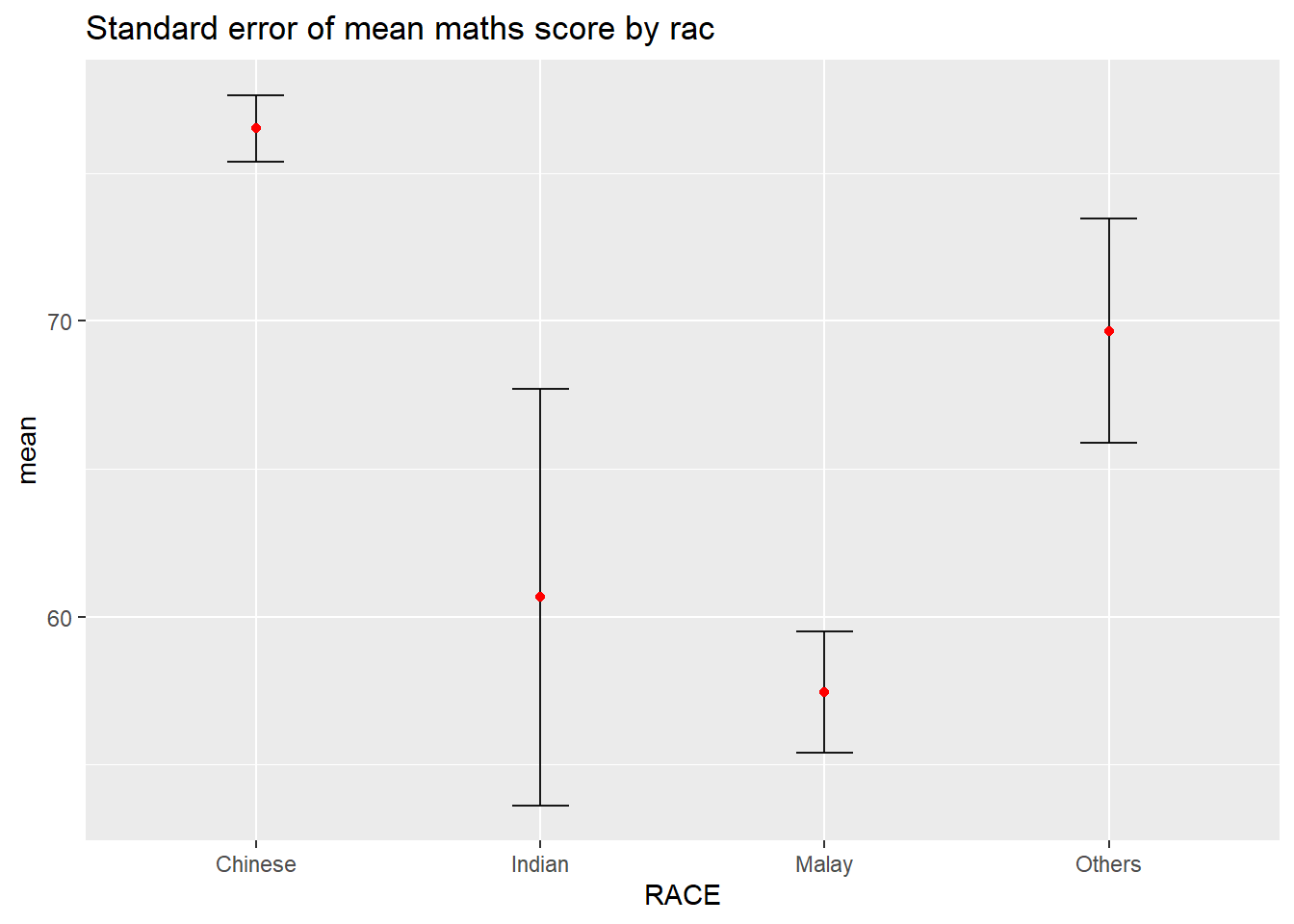
11.3.2 Plotting confidence interval of point estimates
ggplot(my_sum) +
  geom_errorbar(
    aes(x=reorder(RACE, -mean),
        ymin=mean-1.96*se,
        ymax=mean+1.96*se),
    width=0.2,
    colour="black",
    alpha=0.9,
    linewidth=0.5) +
  geom_point(aes
           (x=RACE,
            y=mean),
           stat="identity",
           color="red",
           size = 1.5,
           alpha=1) +
  labs(x = "Maths score",
       title = "95% confidence interval of mean maths score by race")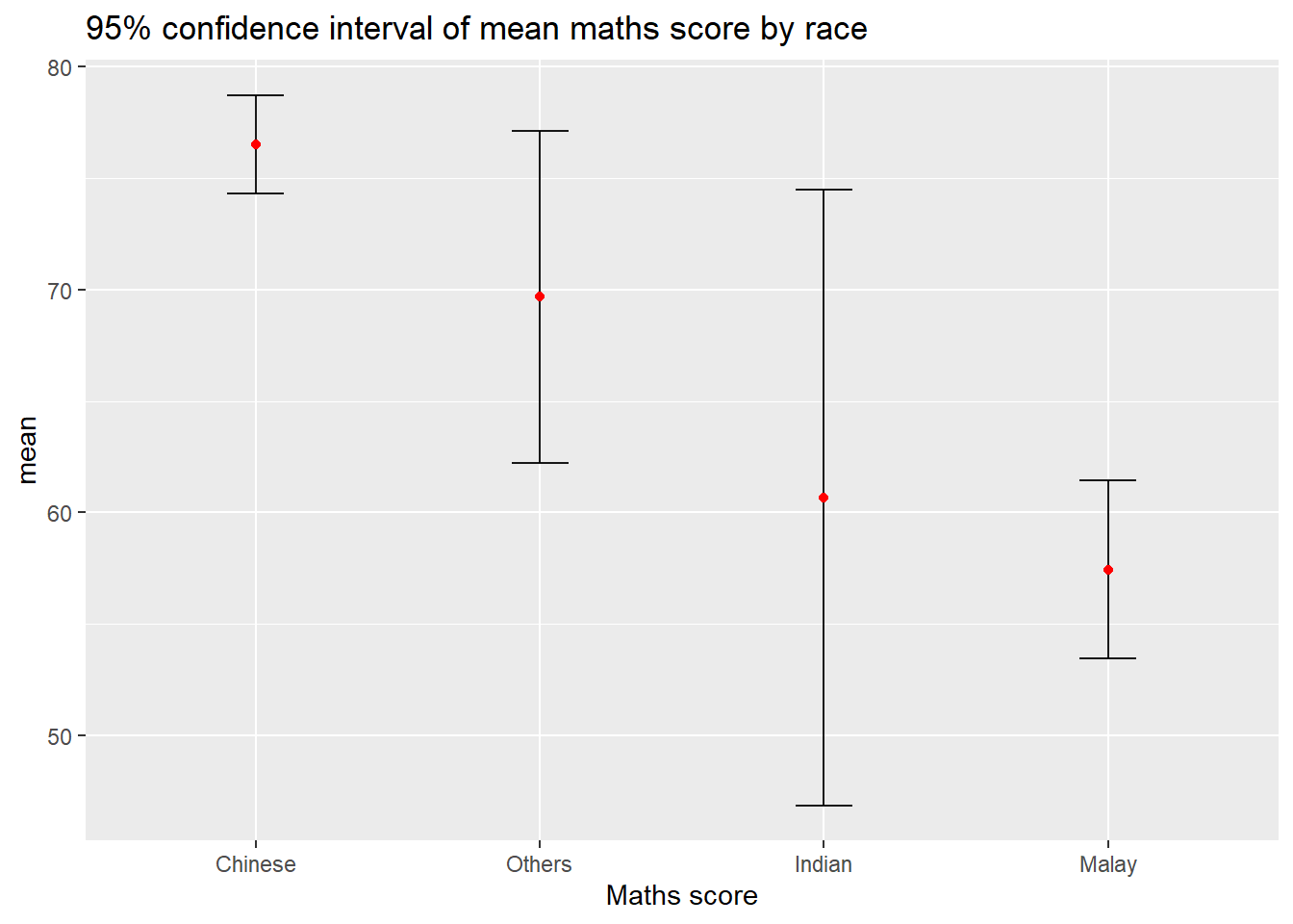
11.3.3 Visualizing the uncertainty of point estimates with interactive error bars
shared_df = SharedData$new(my_sum)

bscols(widths = c(4,8),
       ggplotly((ggplot(shared_df) +
                   geom_errorbar(aes(
                     x=reorder(RACE, -mean),
                     ymin=mean-2.58*se,
                     ymax=mean+2.58*se),
                     width=0.2,
                     colour="black",
                     alpha=0.9,
                     size=0.5) +
                   geom_point(aes(
                     x=RACE,
                     y=mean,
                     text = paste("Race:", `RACE`,
                                  "<br>N:", `n`,
                                  "<br>Avg. Scores:", round(mean, digits = 2),
                                  "<br>95% CI:[",
                                  round((mean-2.58*se), digits = 2), ",",
                                  round((mean+2.58*se), digits = 2),"]")),
                     stat="identity",
                     color="red",
                     size = 1.5,
                     alpha=1) +
                   xlab("Race") +
                   ylab("Average Scores") +
                   theme_minimal() +
                   theme(axis.text.x = element_text(
                     angle = 45, vjust = 0.5, hjust=1)) +
                   ggtitle("99% Confidence interval of average /<br>maths scores by race")),
                tooltip = "text"),
       DT::datatable(shared_df,
                     rownames = FALSE,
                     class="compact",
                     width="100%",
                     options = list(pageLength = 10,
                                    scrollX=T),
                     colnames = c("No. of pupils",
                                  "Avg Scores",
                                  "Std Dev",
                                  "Std Error")) %>%
         formatRound(columns=c('mean', 'sd', 'se'),
                     digits=2))
11.4 Visualising Uncertainty: ggdist package
11.4.1 Visualizing the uncertainty of point estimates: ggdist methods
exam %>%
  ggplot(aes(x = RACE,
             y = MATHS)) +
  stat_pointinterval() +
  labs(
    title = "Visualising confidence intervals of mean math score",
    subtitle = "Mean Point + Multiple-interval plot")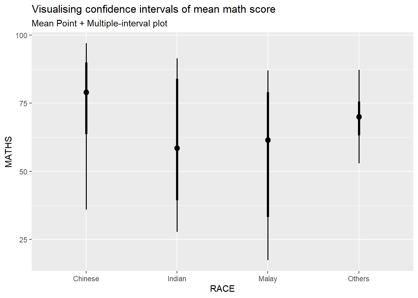
exam %>%
  ggplot(aes(x = RACE, y = MATHS)) +
  stat_pointinterval(.width = 0.95,
  point_interval = "median_qi") +
  labs(
    title = "Visualising confidence intervals of median math score",
    subtitle = "Median Point + Multiple-interval plot")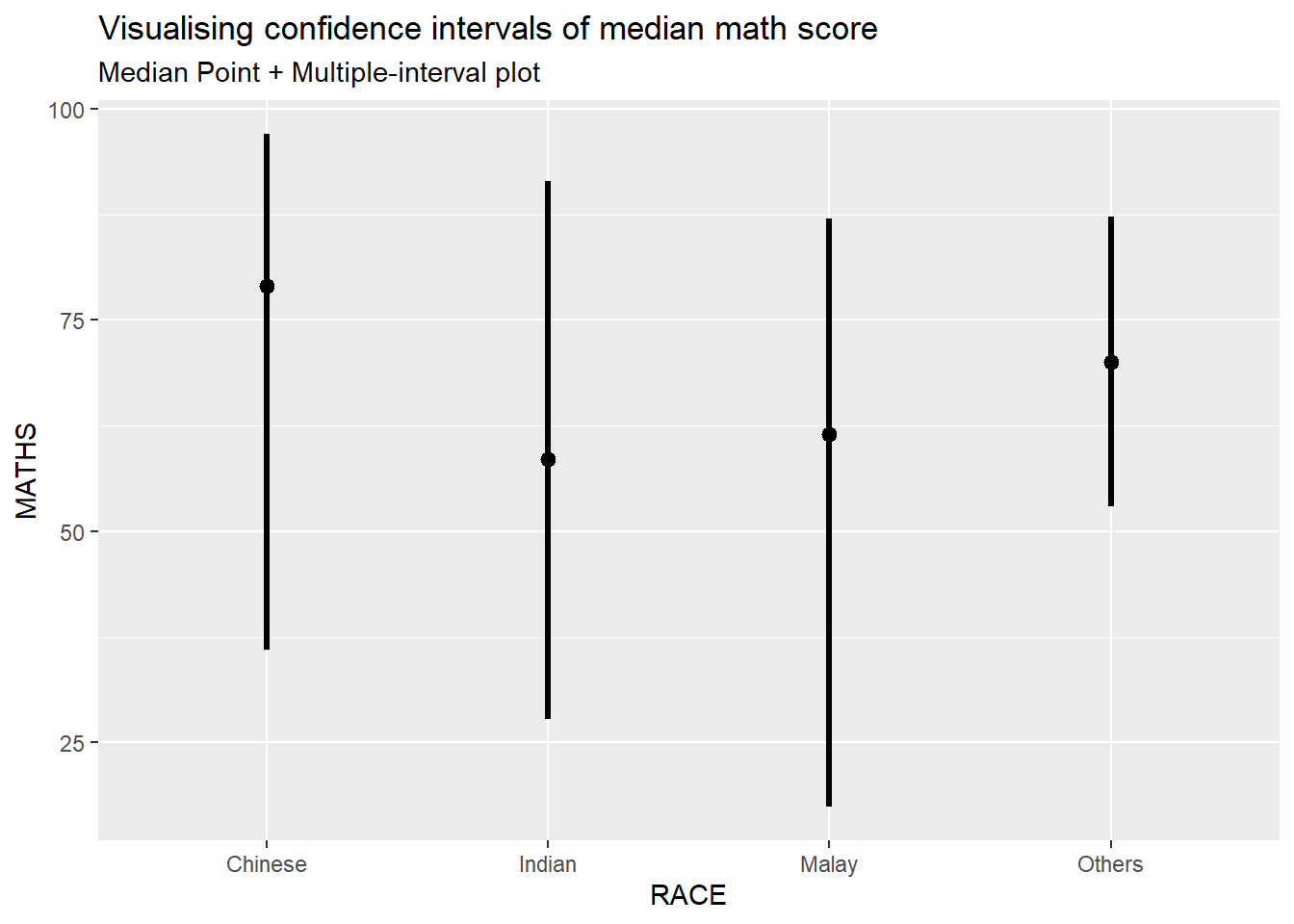
11.4.2 Visualizing the uncertainty of point estimates: ggdist methods
exam %>%
  ggplot(aes(x = RACE,
             y = MATHS)) +
  stat_pointinterval(
    show.legend = FALSE) +
  labs(
    title = "Visualising confidence intervals of mean math score",
    subtitle = "Mean Point + Multiple-interval plot")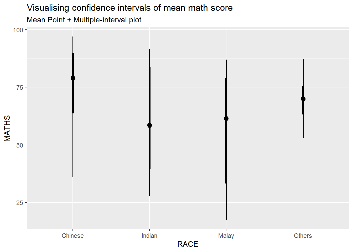
11.4.3 Visualizing the uncertainty of point estimates: ggdist methods
exam %>%
  ggplot(aes(x = RACE,
             y = MATHS)) +
  stat_gradientinterval(
    fill = "skyblue",
    show.legend = TRUE
  ) +
  labs(
    title = "Visualising confidence intervals of mean math score",
    subtitle = "Gradient + interval plot")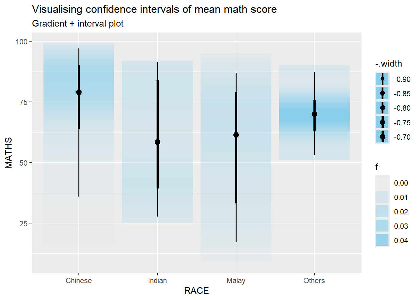
11.5 Visualising Uncertainty with Hypothetical Outcome Plots (HOPs)
11.5.1 Installing ungeviz package
Note: You only need to perform this step once
devtools::install_github("wilkelab/ungeviz")
11.5.2 Launch the application in R
library(ungeviz)11.5.3 Visualising Uncertainty with Hypothetical Outcome Plots (HOPs)
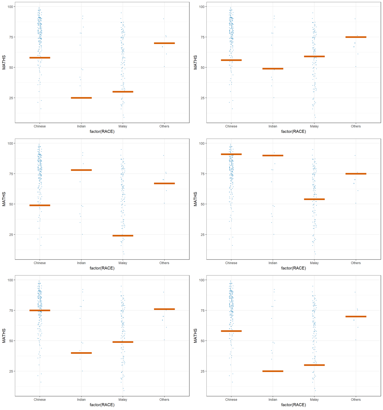
ggplot(data = exam,
       (aes(x = factor(RACE),
            y = MATHS))) +
  geom_point(position = position_jitter(
    height = 0.3,
    width = 0.05),
    size = 0.4,
    color = "#0072B2",
    alpha = 1/2) +
  geom_hpline(data = sampler(25,
                             group = RACE),
              height = 0.6,
              color = "#D55E00") +
  theme_bw() +
  transition_states(.draw, 1, 3)