pacman::p_load(ggdist, ggridges, ggthemes,
colorspace, tidyverse)Hands-on_EX04a
9 Visualising Distribution
9.2 Getting Started
9.2.1 Installing and loading the packages
For the purpose of this exercise, the following R packages will be used, they are:
ggridges, a ggplot2 extension specially designed for plotting ridgeline plots,
ggdist, a ggplot2 extension spacially desgin for visualising distribution and uncertainty,
tidyverse, a family of R packages to meet the modern data science and visual communication needs,
ggthemes, a ggplot extension that provides the user additional themes, scales, and geoms for the ggplots package, and
colorspace, an R package provides a broad toolbox for selecting individual colors or color palettes, manipulating these colors, and employing them in various kinds of visualisations.
9.2.2 Data import
exam <- read_csv("data/Exam_data.csv")9.3 Visualising Distribution with Ridgeline Plot 9.3.1 Plotting ridgeline graph: ggridges method
9.3.1 Plotting ridgeline graph: ggridges method
geom_density_ridges()
ggplot(exam,
       aes(x = ENGLISH,
           y = CLASS)) +
  geom_density_ridges(
    scale = 3,
    rel_min_height = 0.01,
    bandwidth = 3.4,
    fill = lighten("#7097BB", .3),
    color = "white"
  ) +
  scale_x_continuous(
    name = "English grades",
    expand = c(0, 0)
    ) +
  scale_y_discrete(name = NULL, expand = expansion(add = c(0.2, 2.6))) +
  theme_ridges()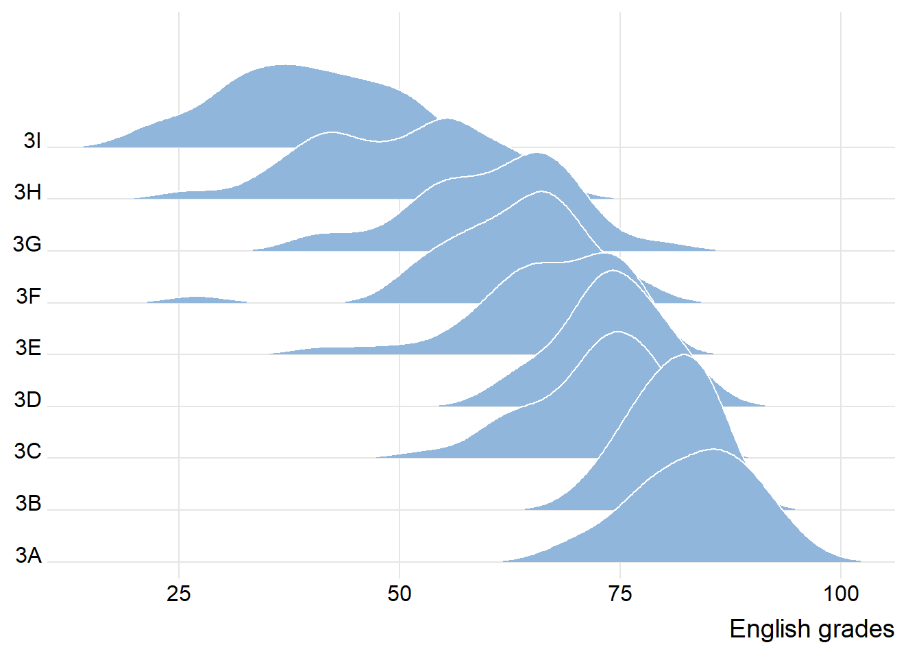
9.3.2 Varying fill colors along the x axis
ggplot(exam,
       aes(x = ENGLISH,
           y = CLASS,
           fill = after_stat(x))) +
  geom_density_ridges_gradient(
    scale = 3,
    rel_min_height = 0.01) +
  scale_fill_viridis_c(name = "Temp. [F]",
                       option = "C") +
  scale_x_continuous(
    name = "English grades",
    expand = c(0, 0)
  ) +
  scale_y_discrete(name = NULL, expand = expansion(add = c(0.2, 2.6))) +
  theme_ridges()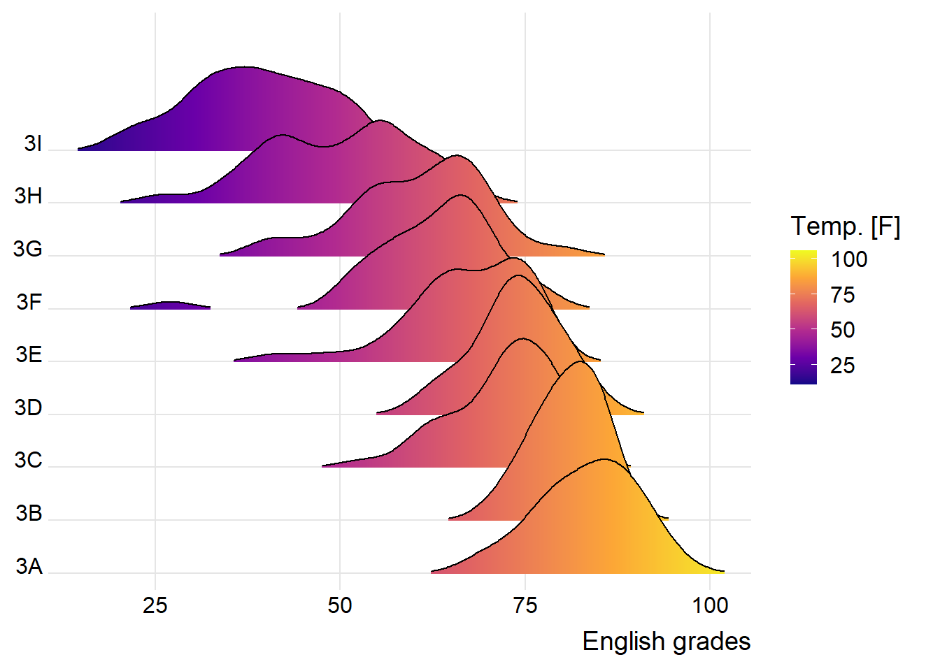
9.3.3 Mapping the probabilities directly onto colour
ggplot(exam,
       aes(x = ENGLISH,
           y = CLASS,
           fill = 0.5 - abs(0.5-after_stat(ecdf)))) +
  stat_density_ridges(geom = "density_ridges_gradient",
                      calc_ecdf = TRUE) +
  scale_fill_viridis_c(name = "Tail probability",
                       direction = -1) +
  theme_ridges()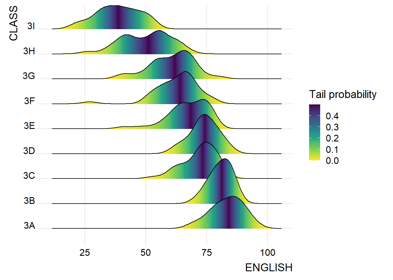
9.3.4 Ridgeline plots with quantile lines
ggplot(exam,
       aes(x = ENGLISH,
           y = CLASS,
           fill = factor(stat(quantile))
           )) +
  stat_density_ridges(
    geom = "density_ridges_gradient",
    calc_ecdf = TRUE,
    quantiles = 4,
    quantile_lines = TRUE) +
  scale_fill_viridis_d(name = "Quartiles") +
  theme_ridges()
Warning: `stat(quantile)` was deprecated in ggplot2 3.4.0.
ℹ Please use `after_stat(quantile)` instead.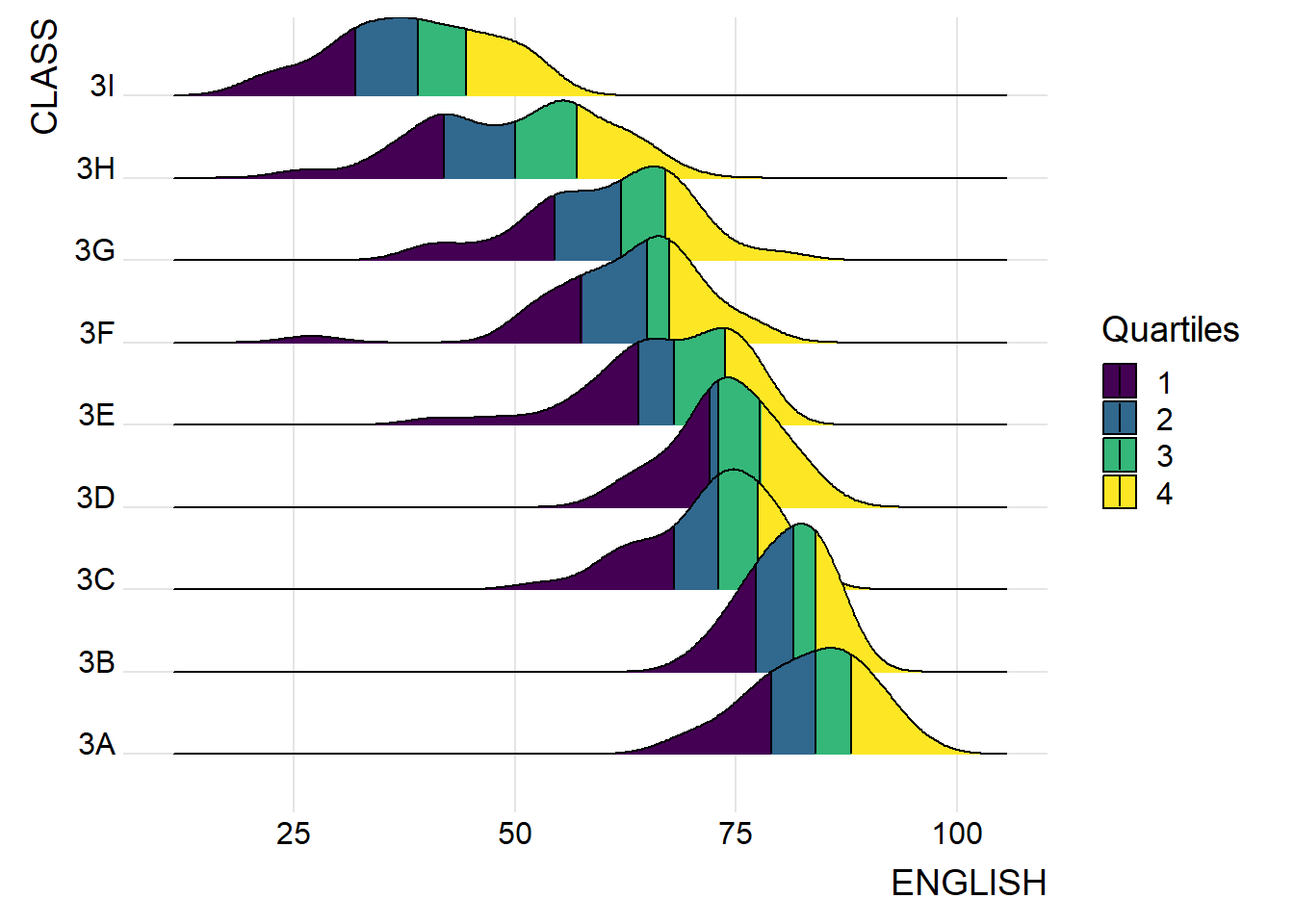
ggplot(exam,
       aes(x = ENGLISH,
           y = CLASS,
           fill = factor(stat(quantile))
           )) +
  stat_density_ridges(
    geom = "density_ridges_gradient",
    calc_ecdf = TRUE,
    quantiles = c(0.025, 0.975)
    ) +
  scale_fill_manual(
    name = "Probability",
    values = c("#FF0000A0", "#A0A0A0A0", "#0000FFA0"),
    labels = c("(0, 0.025]", "(0.025, 0.975]", "(0.975, 1]")
  ) +
  theme_ridges()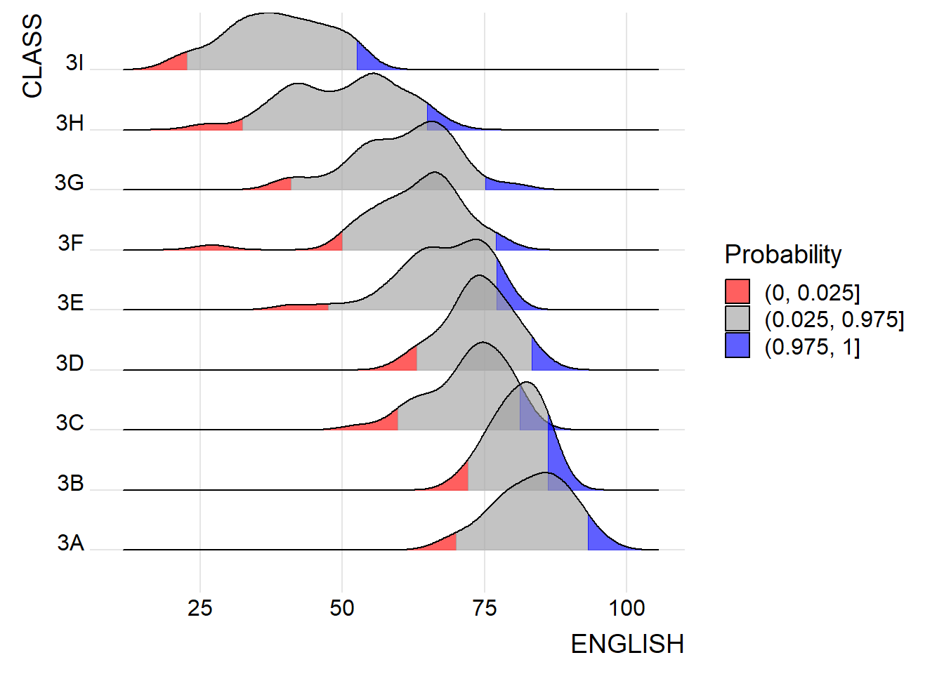
9.4 Visualising Distribution with Raincloud Plot 9.4.1 Plotting a Half Eye graph
ggplot(exam,
       aes(x = RACE,
           y = ENGLISH)) +
  stat_halfeye(adjust = 0.5,
               justification = -0.2,
               .width = 0,
               point_colour = NA)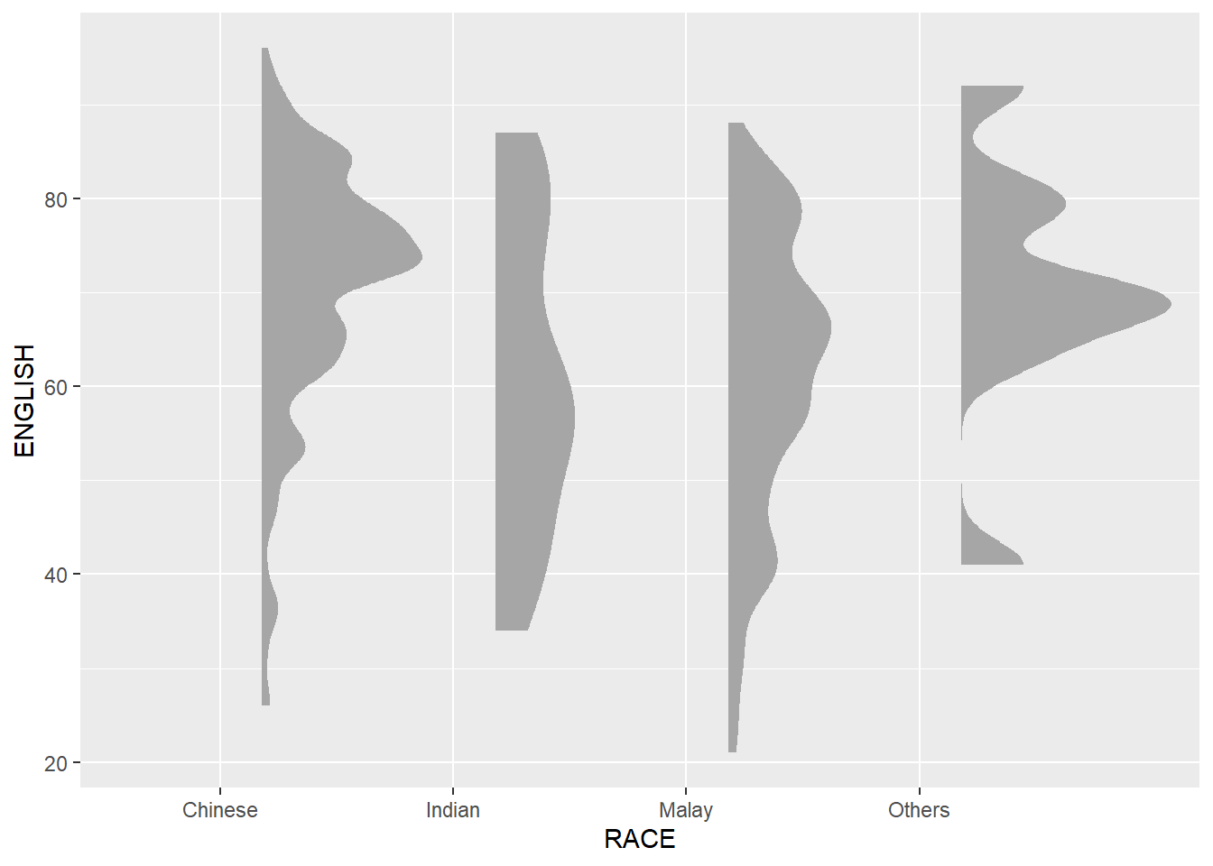
9.4.2 Adding the boxplot with geom_boxplot()
ggplot(exam,
       aes(x = RACE,
           y = ENGLISH)) +
  stat_halfeye(adjust = 0.5,
               justification = -0.2,
               .width = 0,
               point_colour = NA) +
  geom_boxplot(width = .20,
               outlier.shape = NA)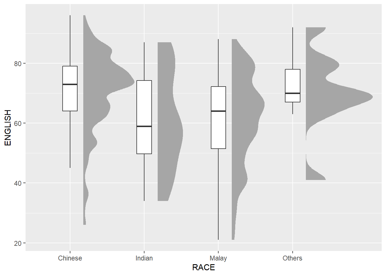
9.4.3 Adding the Dot Plots with stat_dots()
ggplot(exam,
       aes(x = RACE,
           y = ENGLISH)) +
  stat_halfeye(adjust = 0.5,
               justification = -0.2,
               .width = 0,
               point_colour = NA) +
  geom_boxplot(width = .20,
               outlier.shape = NA) +
  stat_dots(side = "left",
            justification = 1.2,
            binwidth = .5,
            dotsize = 2)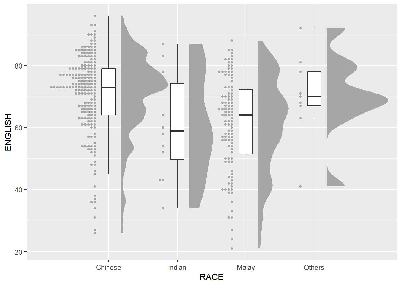
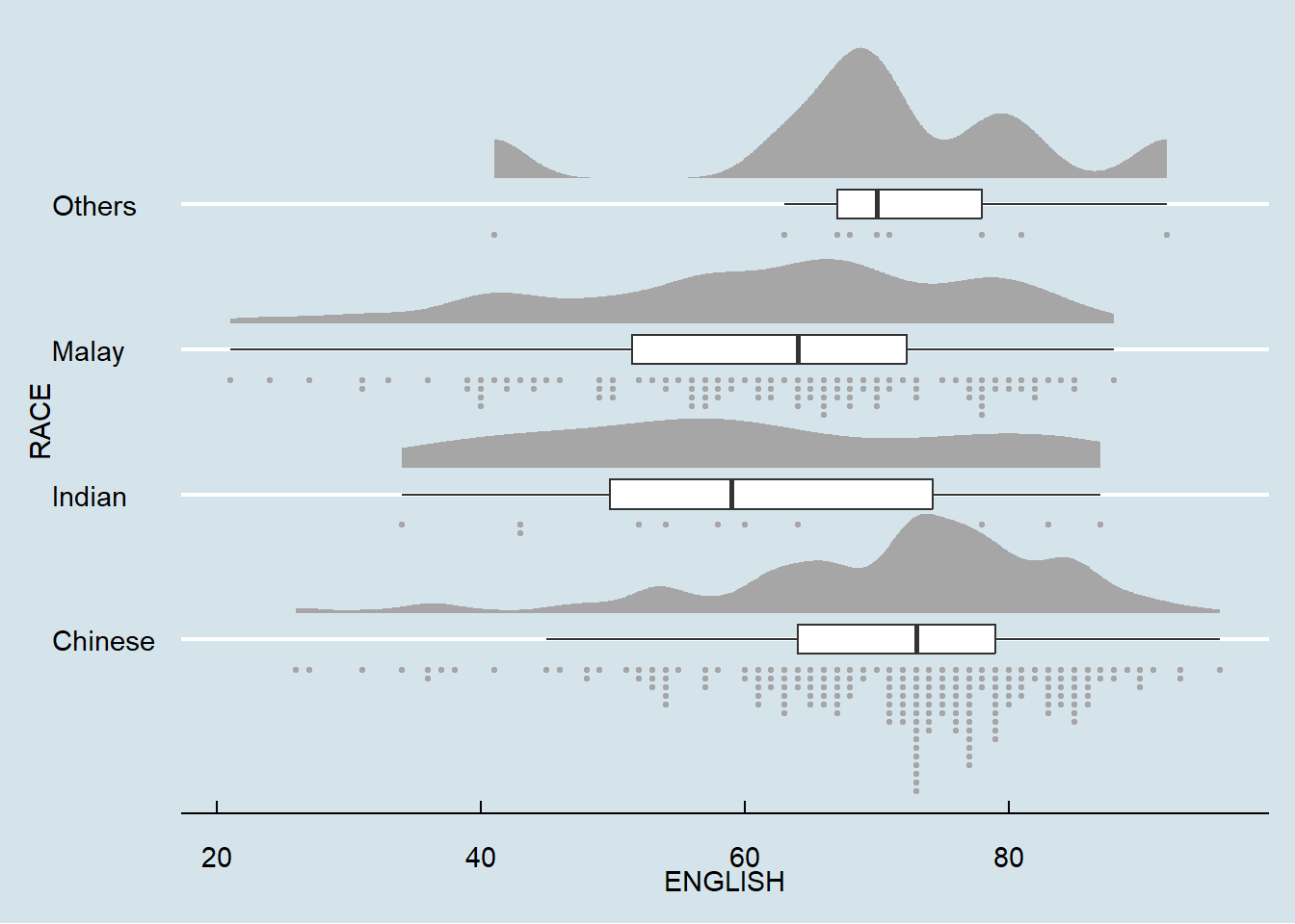
9.4.4 Finishing touch
ggplot(exam,
       aes(x = RACE,
           y = ENGLISH)) +
  stat_halfeye(adjust = 0.5,
               justification = -0.2,
               .width = 0,
               point_colour = NA) +
  geom_boxplot(width = .20,
               outlier.shape = NA) +
  stat_dots(side = "left",
            justification = 1.2,
            binwidth = NA,
            dotsize = 1.5) +
  coord_flip() +
  theme_economist()